Things no one told me about the Sailor Pro Gear Slim, and how I picked mine
This is not a review. I haven’t even had this pen for a month yet. I just wanted to talk about the process of buying a pen, I guess. I know I’m not the only one who deliberates a lot before making a purchase and perhaps others would get a kick out of reading my thought process… or at least they could laugh at how long it is.
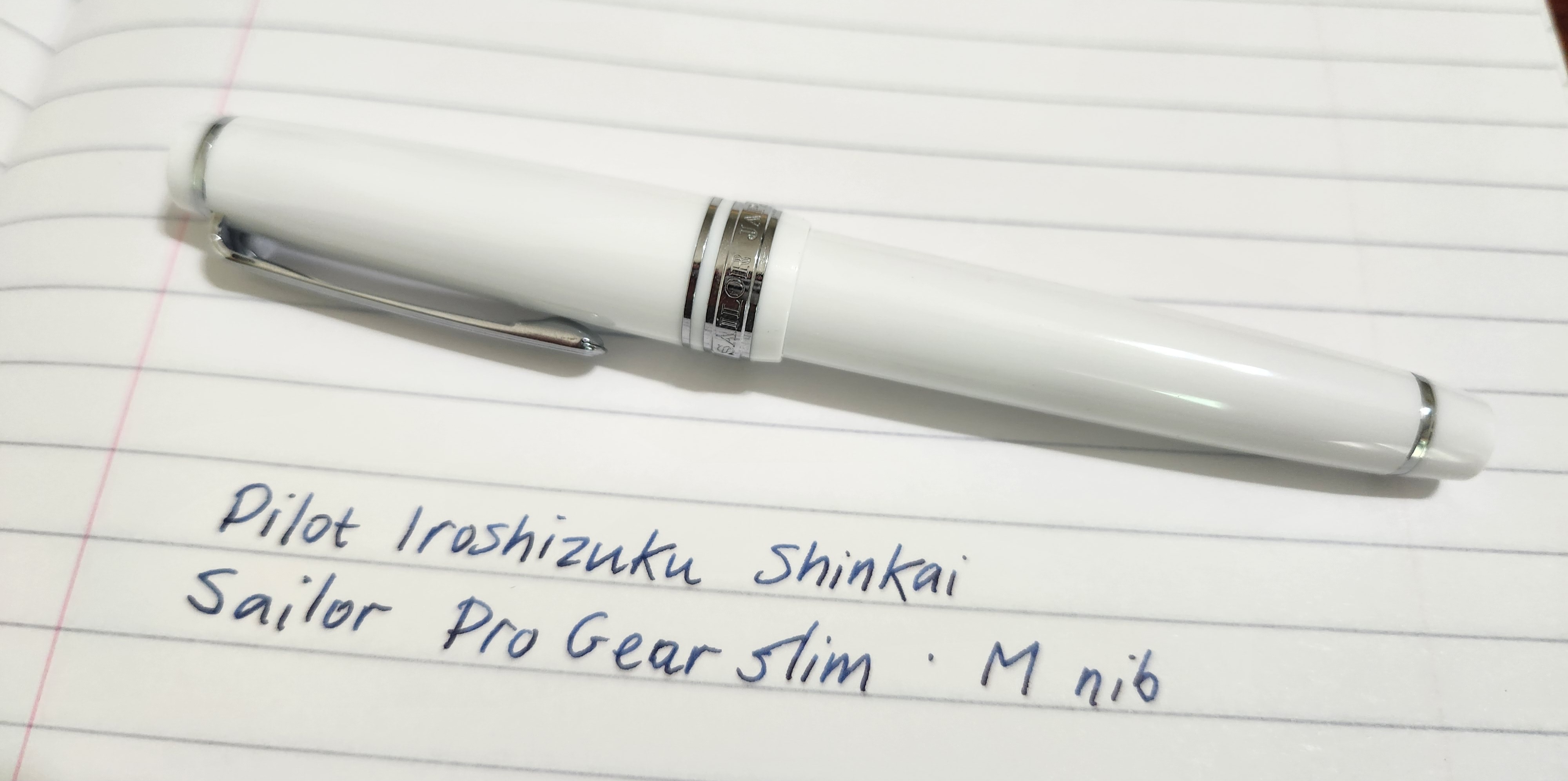
The newcomer.
I decided to get a Sailor Pro Gear Slim (PGS) because I wanted to try a pen with a Sailor gold nib and the PGS is the cheapest full-size one. I found the shape of the tipping interesting, and also wanted to experience the feedback, i.e. feeling of friction when writing, which some people like so much.
So, off I went to a stationery shop, where they had every nib width of all three of Pilot, Platinum and Sailor’s entry level gold-nibbed pens available to try at the counter. I had only tried my own Pilot F before; I was in paradise. I count the time I spent trying pens there into the value of my purchase, since I would’ve felt like a nuisance if I wasn’t about to spend a lot of money.
The first time I touched the Sailor to paper I found the feedback rather unpleasant. But I warmed to it. After some agonising over M vs B, and even having a crisis of faith and considering the Platinum 3776 M, I went for the Sailor PGS in M. This was exactly the pen I had planned to get before arriving at the shop, suggesting that either I did my research properly… or I’m unable to adjust my plans in the face of hard evidence. Well, I’m totally satisfied with the pen so it’s probably the former.
That’s right, I’m totally satisfied with the pen! What a relief. Of course, I’m affected by choice-supportive bias (not to mention ‘spent a lot of money’ bias). Hopefully my opinion won’t change as I continue to use it over the months and years.
Things I discovered after getting my PGS
The pen is pretty much as everyone describes it. But there are some details which I only found out after writing with one myself.
- The tipping really does cause line variation. When you write parallel to the direction of the nib, the line is thinner (and feels smoother), and when you write perpendicular, it’s wider and the end of the line can be slightly squared off. Why does nobody talk about this? I suspected it would be the case, and hunted through quite a few reviews of the PGS, but I never got a firm confirmation. My guess is that the majority of people buy Sailors in MF downward, where the effect is not noticeable(?).
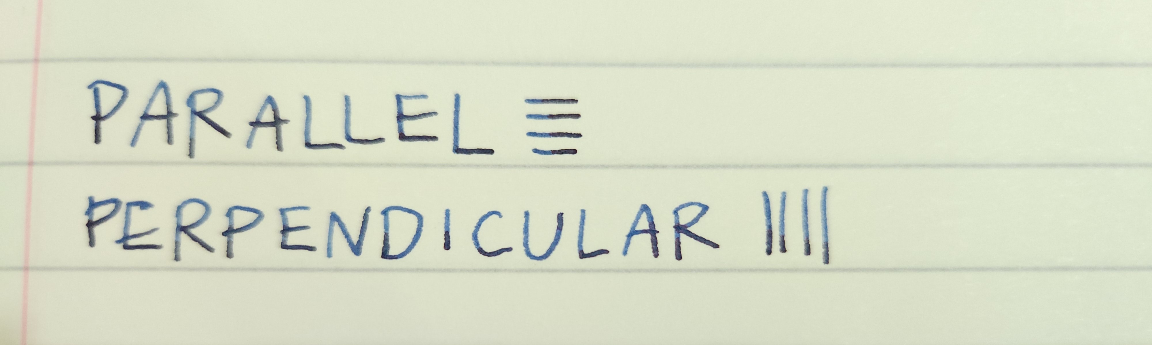
Sorry it’s so blurry, and in the first case the difference is very subtle. But trust me, in person it’s distinctive.
-
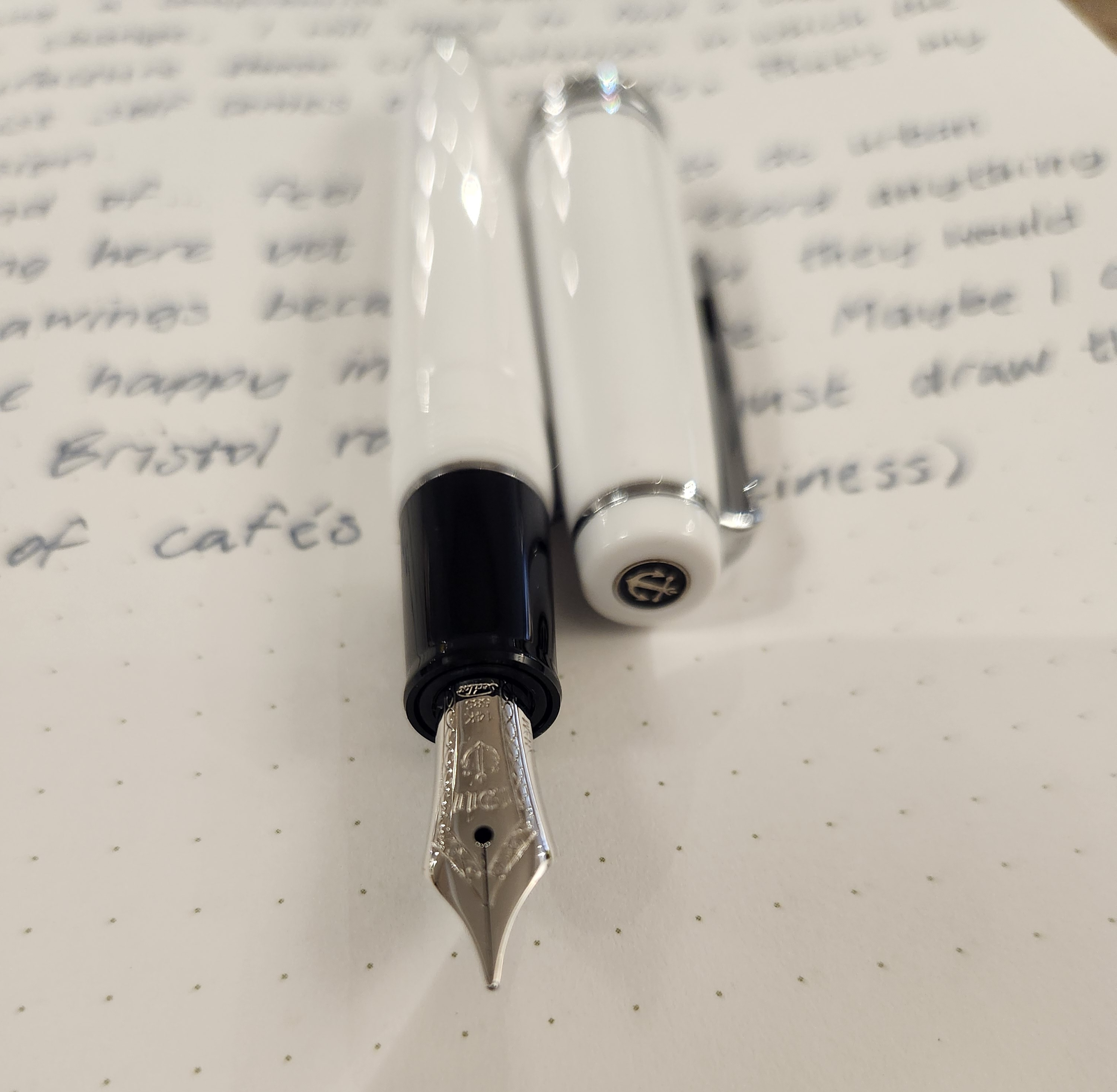
It is more satisfying in the hand than the Pilot Prera, which has very similar dimensions. I don’t like using my Prera for long form writing but am happy using the PGS. It’s a few millimetres longer, even when uncapped, and has a crucial few extra grams of weight. I already found out those specs from the wonderful tables of measurements on the JetPens website, but now I’ve actually held both, I can confirm that it makes a difference.
-
The cap threads have more of a soft and smooth feeling than those on the Pilot Custom 74. I like both in their own way.
-
Although many people say it is, the feel of the nib is not like a pencil (if you ask me). Pencils are smooth and slippery; the Sailor 14k nib is not slippery - it’s rough and grips the page slightly, which is often called ‘feedback’. The feedback really does help to control the movement of the pen when writing1. To me, it feels like using a fine, hard felt-tip marker. I haven’t used a felt-tip in years and I had forgotten how much I enjoy the feeling. And now I can get that from a fountain pen? Cool!
-
Shockingly, I enjoy using the PGS for sketching. Generally my fountain pens are for writing only… probably because they are slippery and lacking in line variation. I’ve always vaguely wished I could use a fountain pen for drawing rather than a disposable pen. Maybe someday I’ll get another one just for drawing with (oh no, I’ve been bitten by the Sailor bug).
I’ve had this pen for a few days now and I’ve been happily using it for drafting short fiction, filling out my planner and jotting words in my vocabulary notebook. I did some small sketches with it as well. The PGS is quite an all-rounder. I think the biggest reason for this is the increased control from feedback.
But another one is the stiffness of the nib. I already knew that the PGS has an exceptionally stiff nib, but what I didn’t realise is what that actually means:
- I don’t have to be careful about how hard I press down when writing because it barely affects the nib or the resulting line at all. Of course, this is all within the feather light range of fountain pen usage, but still. I don’t like flexing my pens, so the softer the nib, the more I have to take care with it. A very stiff one allows me to relax and focus on writing a bit more.
How I chose the colourway
The PGS must hold the world record for the fountain pen model with the most colourways. With all that choice, I thought it would be fun to talk about how I decided on my own one.
-
Nib. Most PGS outside the standard lines are only offered with an MF nib. I wasn’t sure if I would like the MF before trying it in person, but if I didn’t, well, at this price point I would rather buy no pen at all than a pen where I was dissatisfied with either one of the nib or the appearance.
-
Price and availability. I care about the aesthetics of my pens a lot, but the colour is not a huge factor, certainly not to the point where I would pay a significant premium for a different one. I also wanted to buy this pen new. That ruled out most limited edition colourways.
-
Role in the collection. Right now all my pens are clear, black, blue or yellow. I wanted to add a bit more variation while making sure that the pens would still look good together. Specifically, I was thinking of either a red/orange to stand against the blue and yellow, or a white which would contrast the dark colours. All my pens have silver trim, so gold trim would also be a way of adding variety.
-
Usage. I wanted to be able to bring this pen out and about and leave it on tables without it getting stolen, so it shouldn’t look valuable. This put me off gold trim. I may have been over-cautious - the PGS is a tiny pen, so it probably doesn’t look valuable anyway. Regardless, I wanted something that would look unremarkable.
-
Aesthetics. Sailor is one of the few manufacturers which sometimes includes multiple colours of plastic throughout the pen - a different colour for the finials, cap, section, or some wacky combination of the three. I (usually) like the effect and would prefer a pen with this feature. On the other side of things, I don’t like glittery or strongly pearlescent pens. I wanted to avoid noticeable glitter at all costs.
Well then, the opaque white PGS with silver trim and a black section would do just fine, wouldn’t it? I think it looks really clean and tidy somehow. Kind of like… a bathroom sink. And since it’s small, a sober colour scheme is what keeps it looking like a somewhat serious writing tool.
Let me know in the comments if you can think of something more flattering than a bathroom sink. Please…
The black grip section is the most boring way to incorporate a second colour of plastic, but it still pleases me. It also guarantees the grip won’t stain if some ink gets on it, and means that the silver ring on the section nicely marks the transition between white and black rather than looking like a seam.
Turns out there is one downside to the white version, which is that bits of dust from my pen case can cling on to the pen body and they really stand out. Sometimes I catch myself brushing them off at the beginning of a writing session, which is silly.
Runners up
Here are pens that I was considering in the early stages. At that point, I just wanted a Japanese medium/Western fine nib so it was totally down to appearance and filling system (I still wish I could’ve gotten something that takes international cartridges for once). Eventually it had to be a Sailor because I wanted the Sailor nib.
- Sailor PGS in Snow Moon or Autumn Moon (both white with gold trim and black finials), Kiku (pastel orange with gold trim), etc.
- Pilot Lucina in red or orange. I had no idea this pen existed for years and now it’s discontinued… It’s a looker.
- Platinum 3776, probably in red or blue, with gold trim.
- SKB Origin with brass trim.
- FWI Demo with gold trim.
-
As an aside, I don’t know if it’s because I’m only a beginner, but it seems that when writing hanzi (Chinese characters) curved lines are a lot more difficult to get right than those in English letters. After all, in printed English all lines are either straight, a big hook, a small hook, or a loop. So the increased control is especially helpful for me when writing hanzi, which would make sense, since the pen is designed for people to write kanji (Japanese characters). ↩︎