Lennon Tool Bar Atmospheric Twilight
The paper is Clairefontaine 90gsm. Text from Gödel, Escher, Bach by Douglas Hofstadter.
Lennon Tool Bar Atmospheric Twilight is a medium grey with a purple tint and a slightly opaque appearance. This ink is almost completely waterproof. It has a wet and lubricated flow and performs well on uncoated paper.
Lennon Tool Bar is a Taiwanese ink brand. They make a lot of other waterproof colours too, including others in the ‘Atmospheric’ line; I’m apologise that I’m not sure if they are dye or pigment based, but either way they are unusual amongst waterproof fountain pen inks for their range of colours and ease of cleaning.
My bottle of ink came in a simple bottle with an ergonomic grippy lid (which I really like). Note: This is the older 30ml bottle, but when I visited Juspirit I saw their new 35ml bottle, which is more distinctively shaped and comes in a display-worthy box.
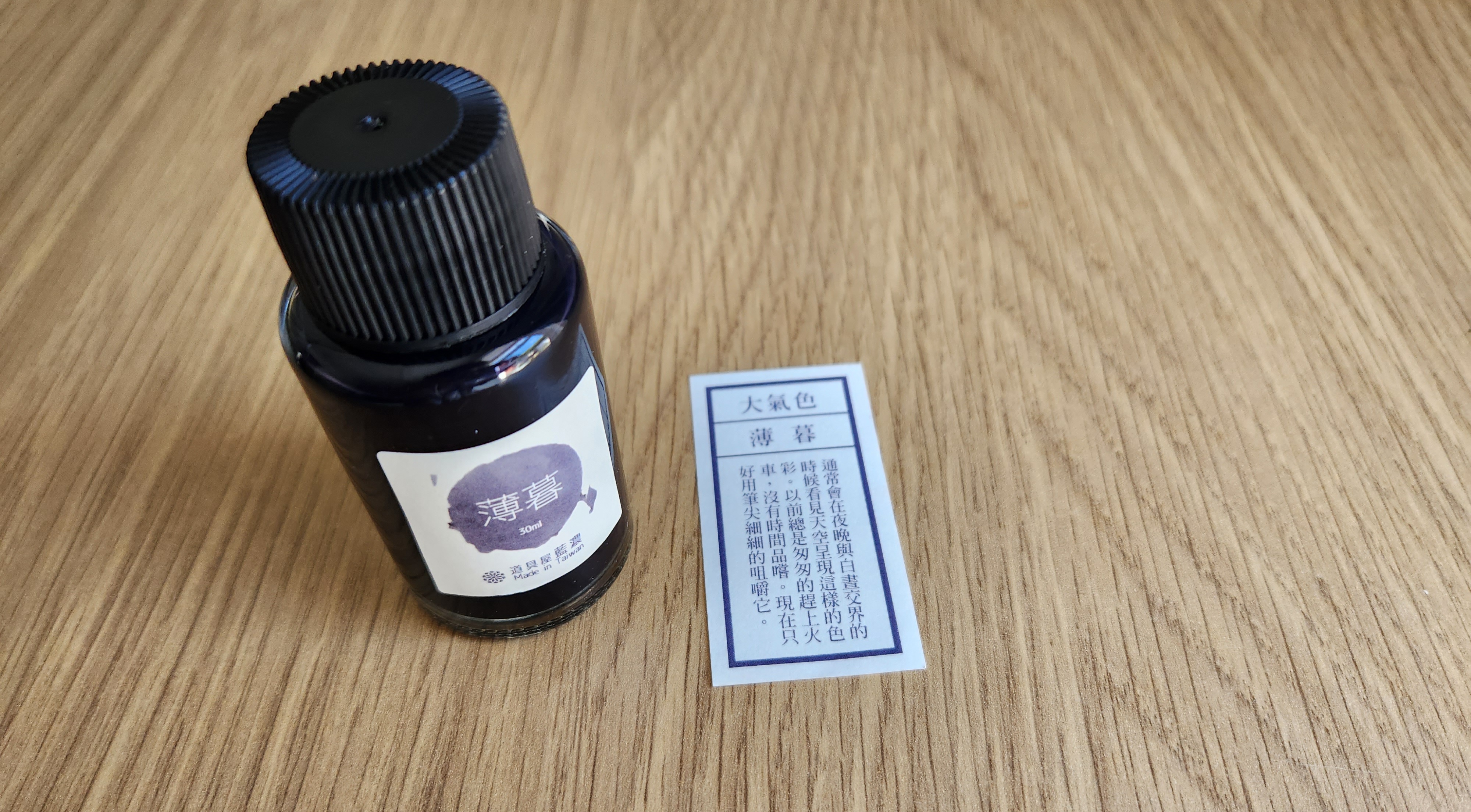
My box also contained that small slip of paper, which is a description of the ink colour.
The colour of this ink varies noticeably depending on the paper. For example, on Clairefontaine and Optik, it’s a cool grey, but on Tomoe River and Midori MD it’s a dusky almost-purple which matches twilight very well. I would say the purple element is neither cool nor warm (on the cream MD paper it looks warm). The ink has very little shading, and looks different to typical inks in a way I’m struggling to describe - it has a slightly opaque and pearly look to it - but nothing noticeable.
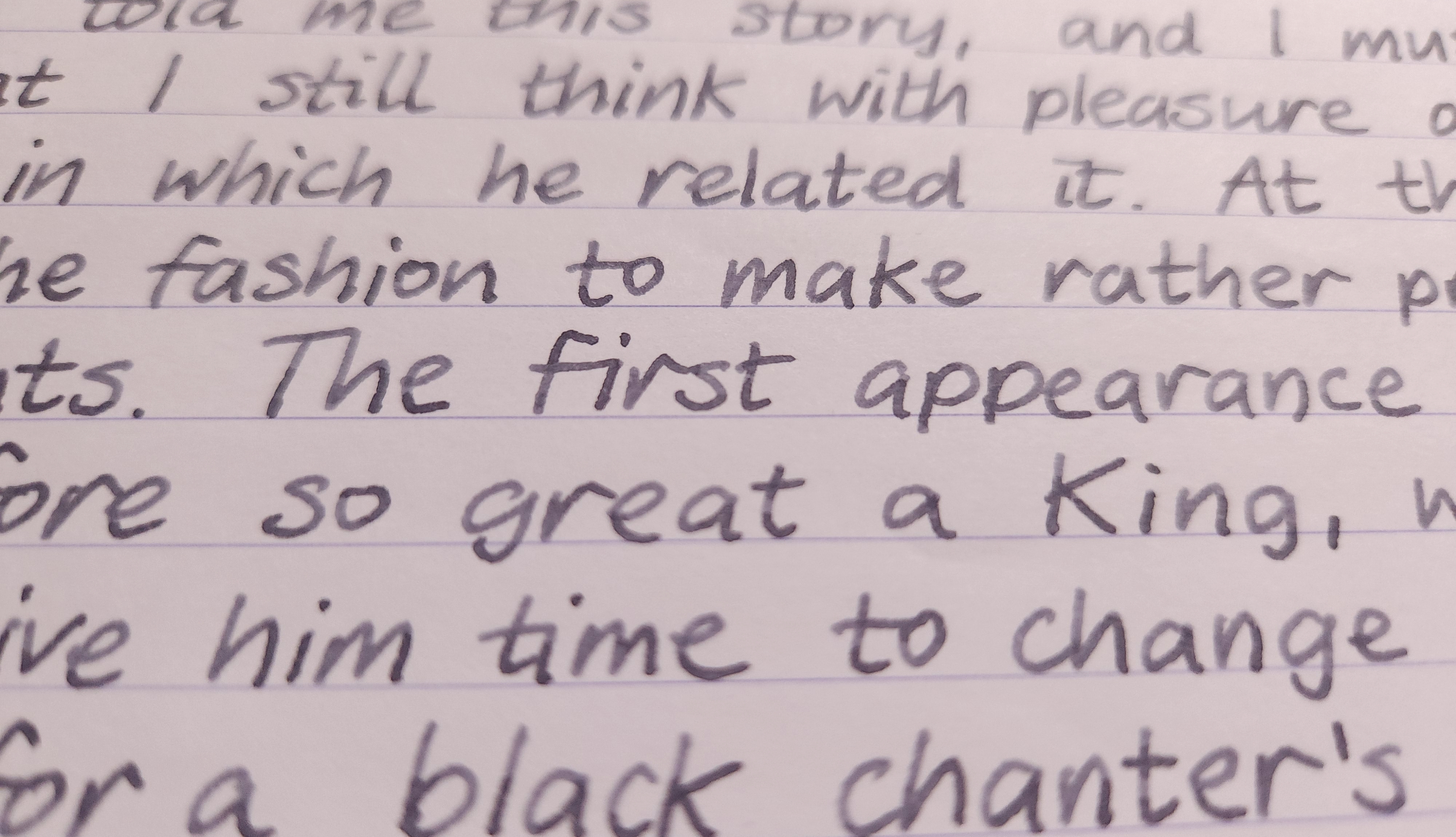
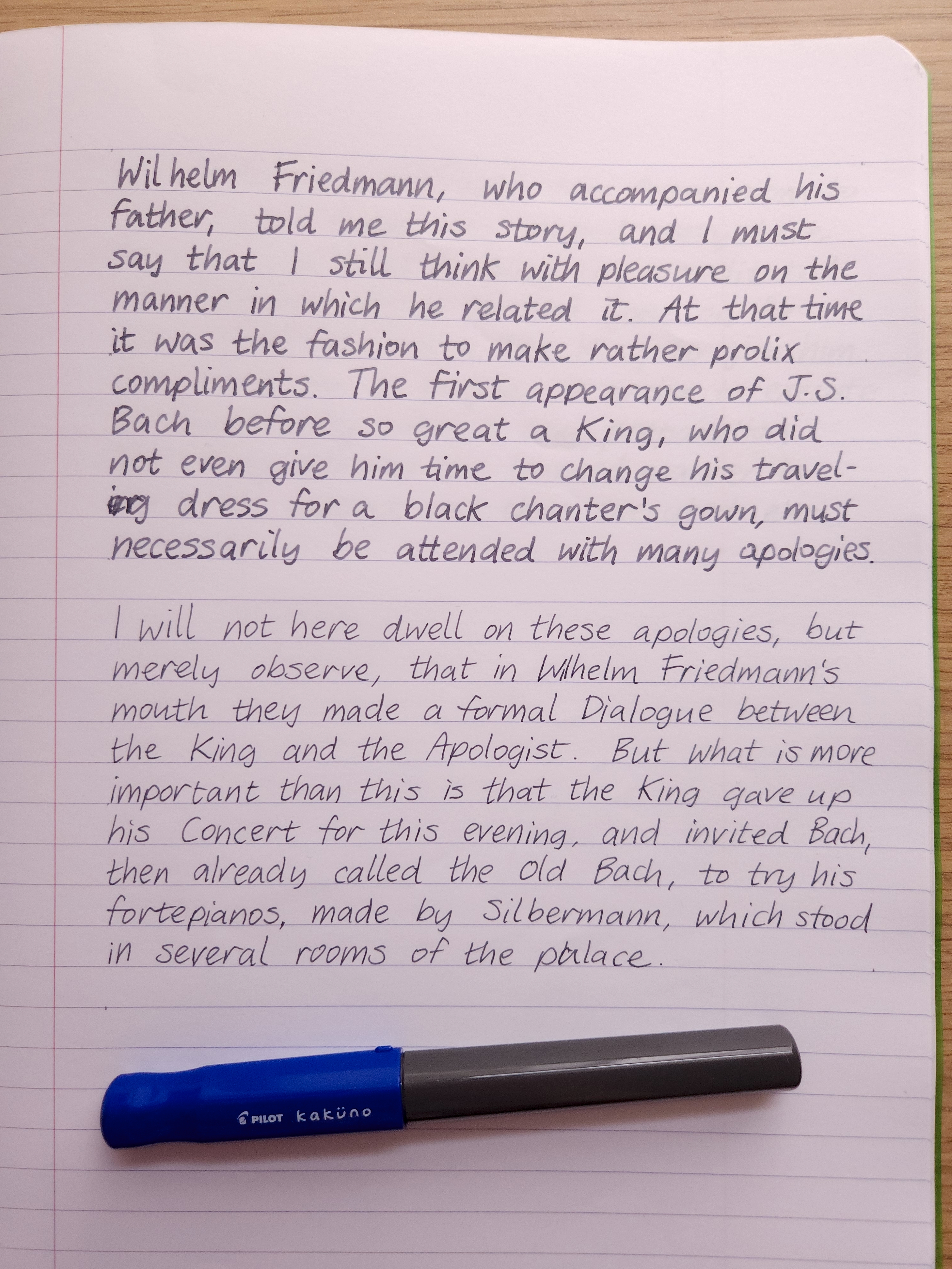
Lamy Safari, B nib
It’s nicely wet and smooth, perhaps a bit more than (for example) your average Diamine ink. On uncoated paper, I only saw slight bleedthrough in a broad nib.
The standout property of this ink is the water resistance. When exposed to water the original writing is totally preserved, with only the faintest amount of grey lifting off with the water. I found it easy to clean out of my pens and cartridges, which is an advantage over iron gall inks. It doesn’t come with a warning that it’ll clog your pen if you leave it to dry out either, although I’m not going to test that for myself.
This might be of interest to artists who like to add some watercolour to their ink drawings. I tested it out with some random drawings on (cheap) watercolour paper.
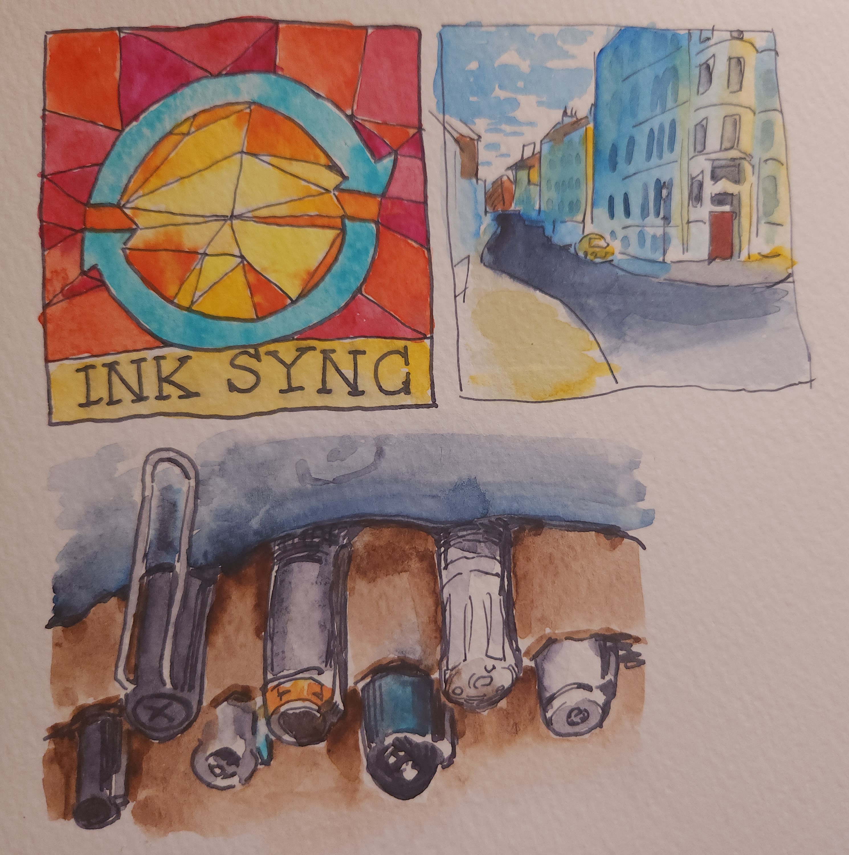
A version of the website logo, a sketch from a photo I took, and… fountain pens!
The only time it let me down was on the top left doodle, when I painted yellow directly over the ‘INK SYNC’ written with the broad nib; the brush lifted off enough colour, and the yellow was pale enough, to create some muddiness. You can see in the top right that I had no trouble painting light colours over fine lines. (As an artist my other caveat is that the ink’s colour is really a midtone and not going to get you into darker values.)
This ink is a bit self-contradictory: the unique colour matches well with the transience and ambiguity of twilight, but the water resistance is totally unambiguous. I can’t get over that water resistance - I find myself saving the ink for important notes or sketches, even though it’s worth using just from an aesthetic standpoint too.
Pilot Kakuno, F nib
Comparisons
Note: I took these comparison photos under different lighting conditions because Kaweco Smokey Grey kept showing up as reddish on camera. I’m still not really satisfied with it. I swear, it’s a true grey! Perhaps slightly more yellow than Diamine Grey, certainly not reddish.
Lennon Tool Bar Atmospheric Twilight is noticeably cooler. Diamine Grey is slightly darker. Kaweco Smokey Grey has much more shading.

I happened to record all three together in my currently inked log, so you can see the difference on MD paper too.

In use
This ink’s colour may be lovely, but it’s also subtle and easily drowned out. For example… by Diamine Lavender in this photo.
Lamy Safari B nib on Optik paper. With Diamine Lavender and SKB Blue
I think it looks best alongside other desaturated colours, pastels, or plain black.
Pilot Kakuno F nib on Midori MD paper. With a Diamine brown mix